Investing is a numbers game, and at the beginning it can be very daunting. One wrong move and a great deal could be lost in the blink of an eye, so knowing how to avoid disaster is paramount to success. However, that is easier said than done. Having the proper tools and knowledge is the first step forward in an investing career, and a great way to ensure that you stay ahead of the game.
This article’s intent is to shed some light on one of those tools in an investor’s arsenal, and will primarily benefit those just getting started. For those already familiar with the topic, it will be best to skip to the last section to learn a little more about why FAST Graphs has chosen to support the methods they do.
As mentioned, knowledge is an important tool. Having something at your disposal is great, but it helps to know how to use it. Therefore, understanding the concepts, formulas, and nuances to your tools is the perfect way to optimize your experience. To help prepare new investors for their career and to shed light on some things the veterans may not have known, this article will be covering the price-to-earnings ratio, or P/E ratio.
What is the Price-to-Earnings Ratio?
The P/E ratio is a very useful tool that can serve as a guideline for an investor, and also helps set a sort of standard in the market. This ratio is a formula that is simple and readily available, and uses information that is free and public, so just about anyone can use it without too much trouble. But as mentioned earlier, there is more to a tool than just having it. Knowing what it is will be crucial.
In short, the P/E ratio is a measurement of a company’s current share price relative to its earnings-per-share (EPS). In other words, it is a formula used to determine roughly what value the market will assign a particular stock. One thing to keep in mind is that not all people refer to this as the P/E ratio. Some call it the price multiple or even the earnings multiple, so when looking for more information this will be useful to keep in mind.
As the P/E ratio is a mathematical formula, there is a little thinking involved, or at least a calculator. The ratio is simple, though, and is merely the expression of price divided by earnings, but if that was all there was to it then no one would bother writing an article about it. The P/E ratio has some failings, and knowing this will be key to making the most of it.
Price of a share is typically accurate because it is reported in real time, so it is very rarely going to be a problem. The earnings, on the other hand, is where things get tricky. Earnings tend to be reported quarterly, and can sometimes take as long as two months to public report and publish. By the time these earnings are reported, it is possible the company will already be well into the next quarter, and as a result, this delayed reporting on earnings ensures that the P/E ratio remains an estimate rather than a truly accurate calculation.
Despite this potential discrepancy, investors and analysts will use the P/E ratio to determine the value of a company’s shares by comparing it to the company’s historical record, or to projected earnings for the future. It is also commonly used when comparing two or more companies, comparing aggregate markets against one another over time, or when comparing to an industry group or established benchmark like the S\u0026amp;P 500. No matter what situation the P/E ratio will be used in, it will be critical to know whether the earnings estimate is for the future (projected) or values from the past (trailing).
Though we’ll go into more detail about these situations later, it is important to know because trailing reports have a tendency to be outdated as they use information from the last fiscal year. On the other hand, projected estimates are a best-guess situation regarding future earnings, and have a whole host of problems that could crop up at any time.
Why is the P/E Ratio Important?
With all that has been said so far, the P/E ratio might not sound like the most trustworthy tool. Certainly, there are pitfalls that need to be avoided, and it should never be taken as gospel, but it is still the most commonly used formula by analysts and investors to determine the valuation of a particular stock. This goes to show that even if there are problems, it is still better than the alternatives, and until something better comes along, if ever, it will continue to be the go-to tool for determining whether a stock is over- or undervalued.
When reviewing P/E ratios, a high value would imply that investors are anticipating higher earnings growth in the near future. A high P/E ratio can also imply that a company is performing better than they did in the previous year. On the other hand, a low P/E ratio tends to suggest the opposite; a company is likely struggling when it has a low P/E ratio, or is showing some sort of decline, temporary or otherwise, or it may be influenced by something else entirely.
It is very possible for projected earnings, and even real earnings, to be affected on a macro scale, such as with major windfalls or situations within a market that could lead to greater frequency of investment or even aversion to a particular market that could have investors running to more promising prospects. Sometimes, these events are obvious well before they actually happen, but occasionally, they pop up suddenly and without warning. This is one of the major drawbacks of using forward projections in the calculations.
The nature of the P/E ratio allows it to serve as a method of standardization for the market by a means of establishing a relatively consistent value for $1 of earnings. In this regard, by taking values from several years and calculating a mean to use as a benchmark, an investor could determine whether a stock is worth buying or avoiding. In a perfect world, the P/E ratio will show what the market is willing to pay for stock today based on the projected earnings, or the earnings of the prior year. But as we’ve discussed already, there are reasons to bring a little skepticism to the table.
The P/E Ratio Formula and Calculation
We’ve already established that the P/E ratio is a simple formula.
The ratio equals the market value per share over the earnings per share. You may simply divide the current price by the earnings and you’re all set. These stock prices you’d be using can be acquired on virtually any financial website, and are generally considered to be reliable numbers. The earnings-per-share, however, are less certain and this is because they are a projection looking forward, or an analysis of the past, and therefore are either out of date or merely an estimate.
A major part of determining the P/E ratio is whether an investor uses forward values or trailing values. A forward price-to-earnings, also known as a leading P/E, is a method of projecting the P/E values by looking to the future, rather than taking past values into account. As this relies upon estimates and projections, it is not an accurate reflection of value, and should be treated accordingly.
However, it is a very useful way to get an idea of what trends imply about future value, as well as what analysts feel the future may hold. It does have a few other qualities that should be taken into account, too. It is possible for a company to underestimate or short sell their future earnings in order to beat their projected earnings and thereby look like they are performing better than they might actually be. Conversely, they may overestimate their earnings and adjust in their next earnings announcement. This can give the company an opportunity to manipulate perception of their potential.
The alternative to forward P/E is a trailing P/E ratio. Instead of looking at future projections, this method utilizes the performance of the company over the past twelve months. Because it is using real, reported numbers, it is not an estimate, but actual value – so long as the company reports accurately, that is. While this might sound better at first glance, these numbers are outdated, and therefore can only be relied on so much.
Despite that drawback, some investors choose trailing P/E ratios because they do not trust estimates and place their faith in real values. But, past success does not guarantee success in the future. Numbers from the past year could be greatly influenced by a major event which could cause extreme variance if not taken into account, and even if you do try to keep an eye on it, trailing P/E is generally reported quarterly, so it is often out of date the moment it is posted.
Blended P/E Ratio and Why We Use It
In an attempt to tackle some of the deficiencies in forward and trailing P/E, FAST Graphs utilizes a blended P/E ratio, which has a few advantages and helps to make things a little more accurate and reliable. However, just like the other methods of estimating, it is not perfect. The blended calculation uses a weighted average of the most recent, actual value and the closest projected value. By reducing the time frame in both the forward and trailing ranges, the blended calculation takes advantage of more relevant information, and avoids the likelihood of some pitfalls of estimating over a longer period of time.
The blended ratio is not foolproof, and it may be best to utilize it in conjunction with the other ratio types in order to get a better idea of what growth and past performance implies about the future. It can also be helpful to compare the P/E ratio of the target company against those in the same sector. This can help identify whether or not it is a successful business or just a trend in the industry as a whole.
None of these methods are ideal, but they do work – at least better than alternatives. They have their strengths and weaknesses, and therefore, as mentioned earlier, it is important to know how to use the ratio, why we use it, and where these values come from. If you just look at the P/E ratio and base everything off of that without looking at the bigger picture you may run into trouble, but if you step back, observe everything else necessary, then it may just help you make the right decisions.
There are several factors that will cause financial websites to report different P/E ratios. For starters, you must be cognizant of the specific earnings metric that is being utilized. Many sites will utilize diluted (GAAP) earnings when they do the calculation.
FAST Graphs defaults to “Adjusted (Operating) Earnings.” However, “Diluted Earnings (GAAP)” are available with FAST Graphs along with three (3) other metrics (“Normalized Basic Tax-Adjusted Earnings” “Normalized Basic Earnings” “Basic Earnings”). We also offer calculations based on Cash Flow or FFO and AFFO for REITs. The link below is describing the FAST Graphs blended P/E ratio. This approach is utilized with all the metrics that FAST Graphs offers:
Learn more about the Blended P/E
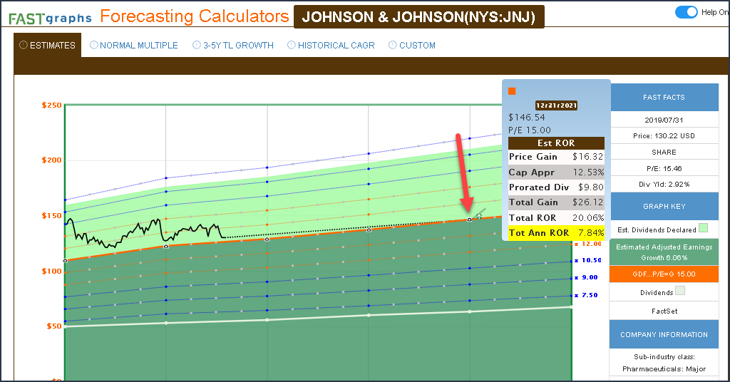
The primary valuation reference line is the orange line on the graph which is produced based on three widely accepted formulas for valuing a business. FAST Graphs automatically utilizes the appropriate formula which is driven by the earnings growth rates achieved by the company over whatever timeframe is being drawn. A more detailed explanation can be found by clicking here.
The black line is the price line. On the Historical Graph, it represents weekly closing prices with the last trading day’s close. On the Forecasting Calculators, it represents weekly closing prices with the last trading day’s close.
The dark green shaded area depict a mountain chart of earnings, and the light green shaded area the dividends that are paid out of those earnings.
The Honeydew line is a plotting of each year’s dividend. However, this line serves two purposes. First of all, it allows the subscriber to determine whether dividends are rising steadily or if there have been dividend cuts. The other function of the honeydew line is that it presents a graphical expression of the company’s dividend payout ratio. The area below this line represents the portion of earnings (the green shaded area) that has been paid out as dividends (the dividend payout ratio).
The dark blue line represents a calculation of the normal P/E ratio that the market has typically applied to a company over whatever time frame is graphed.
The blue normal P/E ratio line is telling you what valuation the market has normally applied to the stock for the period that you are graphing. It does not necessarily indicate that the stock is fairly valued or undervalued, instead, it provides information regarding how the market had most commonly valued the stock over the timeframe being graphed.
It’s important to understand that the normal P/E ratio is a dynamic calculation that can, and will, change when different timeframes are graphed. Therefore, each time you change timeframes, be sure to check the blue FAST FACTS rectangle and note the multiple that the normal P/E ratio is being drawn at.
However, you need to understand that does not necessarily mean that the stock is fairly valued if it trades on that line. In other words, it’s simply a piece of information telling you how the market normally prices the stock. On cases when the normal P/E ratio (the blue line) is way above fair value, it represents an indication that the market normally applies a premium valuation, and vice-versa.
The Analyst Scorecard provides a snapshot of the historical accuracy of analyst estimates when they were forecasting a stock’s earnings one year prior to the actual earnings reported, and two years prior to the actual earnings reported.
The one year estimates are scored within a 10% margin of error, and the two year estimates are scored within a 20% margin of error. The green square with a plus sign represents times when the company beat analyst estimates by more than the respective margin for error, the gold square with a checkmark represents times when the company hit analyst estimates within the respective margins for error, and the red square with a minus sign represents times when the company’s earnings came in below analyst estimates in excess of the respective margins for error.
The scorecard will produce up to 15 years of estimate data, if available. Subscribers can compare the actual earnings to the estimated earnings to determine the exact amount of each year’s earnings beat or miss. The number of analysts making up the consensus is included for each year.
The “Summary” produces a graphic summary indicating how accurate analysts have been for both the one year and two year forward forecasts within the respective margins for error.
NMF stands for No Meaningful Figure, which basically means the program calculated something, but the value calculated has no meaning in this context.
In terms of a growth rate, it could mean that there was a negative or zero value involved in the calculation and, as such, the answer has no meaning.
Here are three videos on the Forecasting Calculators:
Forecasting Future Earnings
Forecasting Future Earnings Growth: A Key To Long-Term Investing Success
How the Forecasting Calculators Work And The Differences Between Them
Forecasting Calculators
All Subscribers (Premium and Basic) have access to five separate color-coded and distinct calculators.
Click Here To Go To Forecasting Calculators Documentation
Analyst Scorecard
There are three options that the subscriber can review and choose by clicking on the tabs at the top of the Analyst Scorecard. The 1Y (one year forward) scorecard calculates previous analyst accuracy within a reasonable 10% margin of error. The 2Y (two year forward) scorecard calculates previous analyst accuracy within a 20% margin of error. The scores are presented in both tabular and graphic form.
Note: The Analyst Scorecard is also built with dynamic features that allow subscribers to remove items from the graphic for simplicity and convenience. If you click on any of the words in the legend at the bottom (Actual, Estimate, Analysts) the lines and/or shadings on the graph will be removed. To bring them back, simply click on the words in the legend again.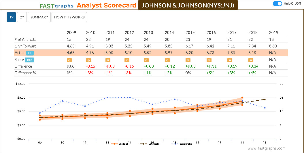
The “Summary” option produces a simple graphical expression of analyst accuracy for both the one-year (1Y) and two-year (2Y) previous forecasts. And finally, there is a tab titled “? How This Works” that provides a brief explanation of the scorecard and scores.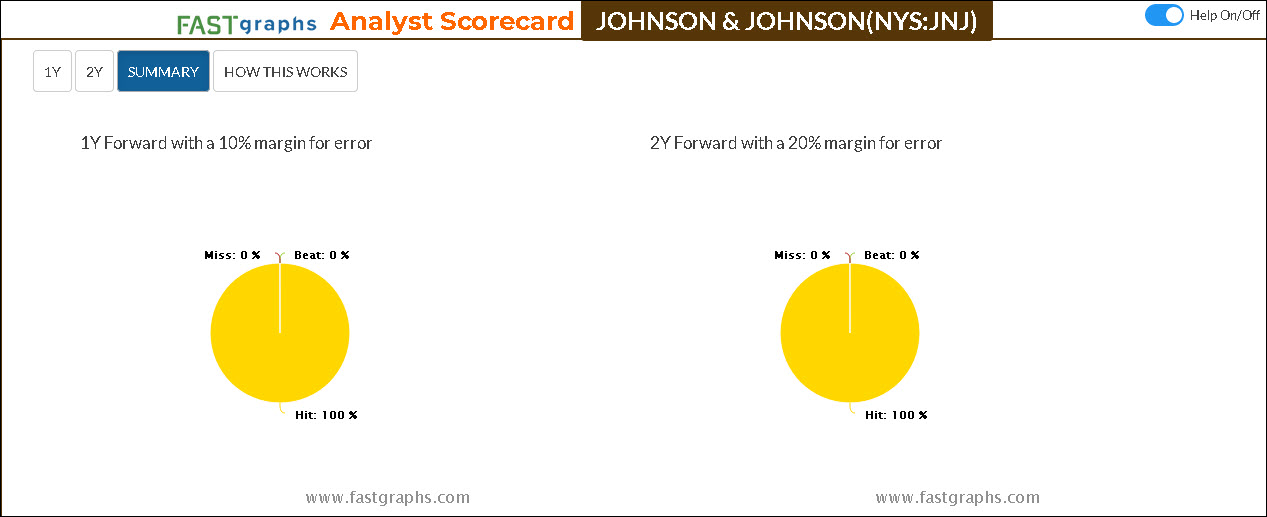
Here are three videos on the Forecasting Calculators:
Forecasting Future Earnings
Forecasting Future Earnings Growth: A Key To Long-Term Investing Success
How the Forecasting Calculators Work And The Differences Between Them
The dividend payout ratio reported by FAST Graphs is relative to the metric utilized. If you are looking at “Adjusted (Operating) Earnings” then the dividend payout ratio would represent the portion of Operating Earnings paid. If you are looking at “Operating Cash Flow” the dividend payout ratio would represent the portion of Operating Cash Flow, etc.
In other words, FAST Graphs produces the payout ratio of the metric being utilized on the associated performance report as well as the area below the white dividend line on the graph.
One of the most valuable features of the research tool is its dynamic capabilities. Each time you draw a different timeframe, important calculations such as earnings growth rate (or the growth rate of whatever metric you are drawing) will be calculated relative to the timeframe drawn. Therefore, it’s imperative that you always check the color-coded section of the FAST FACTS boxes to recognize what multiple the various valuation reference lines are being drawn at.
F.A.S.T. Graphs™ provide several valuation reference lines. The orange line provides a valuation reference of fair value based on commonly use formulas for valuing a business.
The dark blue line represents a calculation of the normal P/E ratio that the market has typically applied to a company over whatever time frame is graphed.
The dark green shaded area depict a mountain chart of earnings, and the light green shaded area the dividends that are paid out of those earnings.
In simple terms, the normal P/E ratio is a valuation reference line that is placed on the graph relative to any timeframe being graphed. At its core, it is attempting to identify and present the P/E ratio that the market has most commonly applied over a given time period. Therefore, it is designed to present a perspective of what might be considered a reasonable valuation to buy or sell a stock at if the user is comfortable with that level of valuation.
With that said, the normal P/E ratio reference line should not be thought of as a precise valuation representing a perfect time to buy or sell. Instead, it’s important that you realize that whatever the normal P/E ratio calculation is will be presented in the dark blue color coded Fast Facts box to the right of the graph. With this information in hand, it’s important to recognize that that normal PE ratio number applies to every spot relating to the blue line (normal P/E ratio line) on the graph.
Consequently, if for example, the normal P/E ratio calculation is 20, then you can look over the entire graph and know that if the price is below that line the stock is trading at a P/E ratio less than 20, if the price is above the line the stock is trading at a P/E ratio higher than 20 and finally if the price is touching the line the stock is trading at precisely the 20 for that example. Of course, you can point your mouse to the black price line and a pop-up will appear that includes the actual P/E ratio of the company for the time you’re pointing at.
In an attempt to clarify further, the best utilization of the normal P/E ratio line is for the analyzer to evaluate how the market has tended to price or value a given company over whatever timeframe being graphed. Again, it is simply a reference line that is utilized to evaluate how the market has valued a company in relation to how it is currently valuing that same company.
This same logic applies to the orange earnings justified valuation reference line. In some companies, the orange reference line will represent the best proxy for fair value, while in other cases; the normal P/E ratio may represent the best proxy for fair value. It is up to the subscriber to analyze those valuation references and decide for themselves what valuation they are comfortable with when considering a given company.
Is also important to note that the normal P/E ratio calculation is dynamic, and will adapt and adjust to how the market has generally valued a given company over different timeframes. Therefore, I will also submit that this is one reason why it’s important to run multiple timeframes when evaluating a company for purchase or sell.
Additionally, F.A.S.T. Graphs™ subscribers are provided the opportunity to draw an additional optional overlay P/E ratio reference line on the graph of their choosing. This simply adds an additional valuation reference line to assist in your evaluation of fair value. Of course, the addition of the overlay P/E ratio option allows the subscriber to pick whatever P/E ratio number they choose. For example, if that normal P/E ratio is 20 and the orange earnings justified fair value calculation is 15, the subscriber can add a third P/E ratio reference line of for example 17.5 that runs or sits in the middle of those two other reference lines. This can provide additional valuation information for the timeframe you are graphing.
But the most important part of what I said, is that these lines should be thought of as references to given valuation levels, and not as absolutes or precise dictums. This is why I refer to F.A.S.T. Graphs™ as “a tool to think with.” It presents essential fundamentals at a glance, and reveals a given company’s operating results and relates those results to how the market has typically priced or valued the company. When you know the multiple that the line is being drawn at, you can analyze the price in relation to either of these lines in order to determine how the market has historically valued the business as well as apply a judgement as to what valuation you might be willing to pay as an investor.
You can look at the pop-ups and they will give an explanation. In order to do this you have to click on the words “FAST FACTS” which turns the pop-ups on.
Here is the pop up explanation of the normal P/E ratio: “This line and ratio represent the calculated P/E multiple at which the market has tended to value the company over time. Calculated by a trimmed average of annual P/E values for the period shown on the graph with one high and one low removed. This line may not have much meaning if the P/E has tended to change in one direction over time.”
Here is a pop up explanation of the orange line: “Shows the growth and the multiple used for the orange valuation line. GDF low growth, GDF…P/E=G avg. growth, P/E=G high growth. This multiple also represents the P/E ratio of the orange line. When the black price line touches the orange line it is trading at that specific P/E multiple.”
You can find the Earnings Calculations for GDF, P/E=G and GDF…P/E=G by clicking here
Yes, subscribers are free to utilize FAST Graphs™ in any articles, blogs or other work that they might desire. All we ask is that you include the entire graph including the FAST FACTS boxes to the right of the graph. The only other requirement we have is that you always include the attribution at the bottom of the graph – Historical Graph – Copyright © 2022, F.A.S.T. Graphs™ – All Rights Reserved
The simple answer is no for the following reasons: FAST is an acronym for Fundamentals Analyzer Software Tool, and as such, were designed to illustrate the relationship between an individual company’s fundamentals (primarily earnings) and their stock price. More plainly stated, FAST Graphs provide research on individual companies.
Additionally, FAST Graphs is based off of a company database. As such, aggregation vehicles such as indices, ETF’s, mutual funds or Closed End Funds usually have limited data. Depending on the aggregation vehicle, our database – FactSet – might have price and performance data, but the underlying earnings information is typically lacking.
The only reason that some funds show up at all is because they are publicly-traded, and the FactSet database does recognize their symbols. However, when you go into the database there is no data other than price data which excludes most fundamental metrics that are typically reported on an individual company. Therefore, you may have noticed that all you typically get on a FAST Graph on funds is a price history. If you look at the bottom of the graph you will notice that no dividends are reported on the graph itself.
With the above said, FAST Graphs could be a useful tool for analyzing ETFs and other aggregate products if you had a list of the product’s holdings. You could then create a FAST Graphs’ portfolio and review each of the holdings independently or create a portfolio review for deeper analysis.
Go to the “Log In” page, click on “Lost your Password?”
Insert your email associated with your FAST Graphs account in space provided, click “Submit”
An email will be sent to you to re-set your password
If you need assistance, please email support@fastgraphs.com.
FAST Graphs™ adjusts all data for any splits. On occasion it might take a day or two for the adjusted numbers to come through, but they will automatically adjust after the split.
Additionally, FAST Graphs™ provides split information in two places. The last item in the FAST FACTS boxes to the right of the graph reports splits with the date and the ratio that the split happened. Additionally, there is a grayed-out option in the legend at the bottom of the graph “Splits.” If you click on that word, any splits that occurred during the timeframe graphed will be noted on the graph.
In summary, once the split occurred, all data, to include price, earnings, dividends, etc. are adjusted by the ratio of the split.
Regarding your Transactions in your Portfolios, the system does not automatically adjust for splits or reorgs. You have to manually go in and adjust your shares and make sure you keep the same cost basis and your per share will change.
On the reinvestment of dividends on your transactions, at this time you have to manually enter it as a trade or you can upload it from your brokerage statements.
FAST Graphs™ receives its data from the FactSet database.
FAST Graphs™ are updated daily (the data contains the prior day’s closing information).
As soon as FactSet receives the data, FAST Graphs™ picks it up.
You can contact us via email at support@fastgraphs.com.
Or give us a call – 813-960-9600
We are in the office Monday – Friday, 9:00 a.m. – 4:30 p.m. EST
FFO (Funds From Operations) and AFFO (Adjusted Funds From Operations) are metrics utilized to evaluate Real Estate Investment Trusts (REITs). When a REIT is being graphed on FAST Graphs, the tool will automatically replace the cash flow metric with the options FFO and AFFO. Note that AFFO data is a relatively new metric and therefore, you will not find as much historical data when utilizing AFFO.
Here are the definitions:
Funds From Operations – FFO
FFO, as defined by the National Association of Real Estate Investment Trusts (\u0026#8220;NAREIT\u0026#8221;) and applied by us, is net income (computed in accordance with GAAP), excluding gains (or losses) from sales of real estate property, plus real estate depreciation and amortization, and after adjustments for unconsolidated partnerships and joint ventures, if any. The Company’s computation of FFO may not be comparable to FFO reported by other REITs that do not define the term in accordance with the current NAREIT definition or have a different interpretation of the current NAREIT definition from that of the Company; therefore, caution should be exercised when comparing our Company’s FFO to that of other REITs. Diluted FFO assumes the exercise of stock options and other potentially dilutive securities. Normalized FFO excludes from FFO certain items which, due to their infrequent or unpredictable nature, may create some difficulty in comparing FFO for the current period to similar prior periods, and may include, but are not limited to, impairment of non-real estate assets, gains and losses attributable to the acquisition and disposition of assets and liabilities, and recoveries of previous write-downs.
We believe that FFO and normalized FFO are important supplemental measures of operating performance for a REIT. Because the historical cost accounting convention used for real estate assets requires depreciation (except on land), such accounting presentation implies that the value of real estate assets diminishes predictably over time. Since real estate values instead have historically risen and fallen with market conditions, presentations of operating results for a REIT that uses historical cost accounting for depreciation could be less informative, and should be supplemented with a measure such as FFO. The term FFO was designed by the REIT industry to address this issue.
Adjusted Funds From Operations – AFFO
In addition to the adjustments included in the calculation of normalized FFO, normalized AFFO excludes the impact of any straight-line lease revenue, amortization of the original issue discount on our convertible senior notes and amortization of debt issuance costs.
We believe that normalized AFFO is an important supplemental measure of operating performance for a REIT. GAAP requires a lessor to recognize contractual lease payments into income on a straight-line basis over the expected term of the lease. This straight-line adjustment has the effect of reporting lease income that is significantly more or less than the contractual cash flows received pursuant to the terms of the lease agreement. GAAP also requires the original issue discount of our convertible senior notes and debt issuance costs to be amortized as non-cash adjustments to earnings. Normalized AFFO is useful to our investors as it reflects the growth inherent in the contractual lease payments of our real estate portfolio.
FAST Graphs covers all US and Canadian stocks. There are approximately 18,000 US and Canadian stock symbols.
The magenta line appears on the graph when you go to your “Settings” gear that allows you to add a Custom P/E Valuation Ratio Line of your choosing to the graph. All you have to do is type in a number, for example, 12, press “Save Changes” and it will draw a P/E ratio of 12 on the graph. Of course, you can delete the overlay and, through trial and error, keep adjusting the P/E ratio overlay as you choose.
Price to Cash Flow (P/CF) is exactly the same as Price to Earnings (P/E) the only difference is you are dividing cash flow by price instead of earnings. Just as it is with any valuation metric, the lower the number, the better the valuation, or stated more plainly, the cheaper the company is.
P/CF is simply telling you what multiple of cash flow you are paying, or put a different way, what multiple of cash flow the company is trading at.
The historical earnings and price correlated FAST Graphs with dividends, if any, are designed to provide a perspective of how the business behind the stock has historically performed.
The historical graphs present essential fundamentals at a glance to include earnings, dividends (if any), and several valuation references. The monthly closing stock price overlay reflects how the market has priced the stock historically based on earnings and/or cash flows.
The historical graphs are dynamic, allowing subscribers to quickly review multiple timeframes in order to determine whether earnings growth has accelerated, decelerated or stayed the same.
There are many additional features that can be applied to the historical graphs, to include a historical year-end dividend yield overlay, an additional P/E ratio add on, and stock splits.
There is also a slider function at the bottom of the graph that allows you to review specific historical timeframes. Additionally, the metrics on the graph can be taken off and replaced by clicking on the words in the orange rectangle at the bottom of the graph.
There are several factors that will cause financial websites to report different P/E ratios. For starters, you must be cognizant of the specific earnings metric that is being utilized. Many sites will utilize diluted (GAAP) earnings when they do the calculation.
FAST Graphs defaults to “Adjusted (Operating) Earnings.” However, “Diluted Earnings (GAAP)” are available with FAST Graphs along with three (3) other metrics (“Normalized Basic Tax-Adjusted Earnings” “Normalized Basic Earnings” “Basic Earnings”). We also offer calculations based on Cash Flow or FFO and AFFO for REITs. The following is describing the FAST Graphs blended P/E ratio. This approach is utilized with all the metrics that FAST Graphs offers:
Blended P/E:
One of the simplest and most commonly used ways to determine the value of a publicly-traded business is by checking the company’s P/E ratio. The formula is very simple, it is simply the current price (P) divided by earnings (E). At first glance, this seems simple enough, but often it is not as simple as it appears.
The company’s stock price is reported in real time on most financial websites that offer a quoting service. But businesses only report earnings on a quarterly basis. Consequently, when we are between the quarterly reports, we really don’t have a precise earnings figure upon which to calculate the P/E ratio.
As a result, not all financial websites report the P/E ratio on the same basis. Some will report P/E ratios based on trailing twelve month earnings (ttm), others might report the P/E ratio based on forward earnings, and some will report P/E ratios on both.
Unfortunately, this can lead to a common mistake that is often made when looking at a P/E ratio on a quoting service. The price or numerator (the top number) is current and accurate. However, it is the earnings or the denominator (the bottom number) that can be problematic. If you are using trailing earnings (ttm), your denominator might be too small, thereby causing the P/E ratio to be higher than it really is. If you are using forward earnings, they might not manifest as expected, thereby causing the denominator to be too large, which makes the P/E ratio calculation look lower than it truly is.
Consequently, FAST Graphs calculates the current P/E ratio by taking a blended approach. Admittedly, like the trailing or forward calculations, a blended P/E ratio might not be perfectly accurate either.
However, we do believe that a blended P/E ratio calculation will be more precise than the two other alternatives. Trailing twelve months’ earnings can be getting stale, especially when we are in the late innings of the next quarter. Earnings estimates out to the next year may be too optimistic. However, giving credit to the current quarter’s earnings estimates are more likely to be realistic or close to it.
Here it is important to note that it takes companies approximately 45 days after the close of the fiscal quarter before the actual numbers are reported. Consequently, it is possible that a trailing twelve month number might be 4 ½ months old.
Therefore, by blended P/E ratio, we mean a weighted average of the most recent actual reported earnings plus the closest quarterly forecast earnings. This gives the most weight to the past “actual” reported earnings, but also includes an appropriate consideration of the company’s continuing earnings power post their last report. For most companies, the blended P/E ratio calculation will be using a moderately higher denominator than trailing twelve months. In other words, we believe the blended P/E ratio calculation is based on a more current level of earnings.
Thanks for the question. The difference between what you see on the Portfolio Review and the graph relates to the timeframes being calculated. The main historical graph includes the current year you are in and one year of forecast. Consequently, the Normal P/E calculation includes those two forward years.
In contrast, the historical Normal P/E ratio reflected in the Portfolio Review is calculating historical Normal P/E ratios only, and does not include the forecast data. The way to see these numbers matching is by utilizing the scroll bar at the bottom of the main graph. Pull the right scroll bar back two years, eliminating the forecast years. Then take the left scroll bar and move it to include, per your example, three years of actual historical data. By doing this you will see that the numbers match. Furthermore, in the Portfolio Review, note that the orange tab at the top in labeled “Historic” thereby indicating it does not include any forecast data.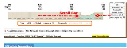
We have four subscriptions:
$15.95 Basic Month-to-Month
$159.50 Basic Annual (12 months for the price of 10)
$48.00 Premium Month-to-Month
$480.00 Premium Annual (12 months for the price of 10)
The main differences you are going to see between the Basic and Premium would be the Premium Subscription has the Screening function, 14 Pre-loaded Portfolios (Dividend Challengers, Champions, Contenders, Fortune 500, NASDAQ 100 S&P 100, etc.), the ability to create up to as many portfolios as you would like, the FUN Graphs (Financial Underlying Numbers) which consists of 60+ additional fundamentals.
There are 9 metrics available for use in FAST Graphs. The metrics consist of 3 Earnings Correlations, 3 Cash Flow Correlations, and 3 Other Metrics (see below)
Earnings Correlations
1. Adjusted (Operating) Earnings
2. Basic Earnings
3. Diluted Earnings (GAAP)
Cash Flow Correlations
1. Operating Cash Flow (OCF, FFO)
2. Free Cash Flow (FCF, AFFO)
3. Free Cash Flow to Equity (FCFE)
Intrinsic Value Correlations
1. EBITDA
2. EBIT
3. Sales
Premium Subscribers have access to all 9 metrics.
Basic Subscribers have access to 6:
1. Adjusted (Operating) Earnings
2. Basic Earnings
3. Diluted Earnings (GAAP)
4. Operating Cash Flow (OCF, FFO)
5. Free Cash Flow (FCF, AFFO)
6. Free Cash Flow to Equity (FCFE)
When evaluating MLPs, the most appropriate metric is cash flow.
It’s important to emphasize the idea that the orange line is relevant as it is with other companies. However, since MLPs are primarily valued based on their income distributions (dividends), the dividend line (honeydew/white) could be considered a more conservative valuation reference line.
GDF is an acronym identifying that the Graham Dodd Formula was utilized, the P/E = G recognizes the formula that Peter Lynch presented in his book One Up On Wall Street. The earnings growth rate calculation, whether it’s “Adjusted (Operating) Earnings or any of the other metrics is the simple compound annual growth rate formula as follows: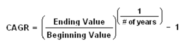
For more information on Earnings Calculations, click here.
You must first export your transactions into a spreadsheet.
Next you must first create a portfolio for your specified stocks.
From there, hit the “Edit B/S” tab and follow the directions below: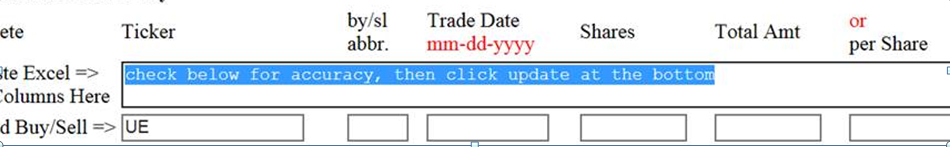
To import an excel buy/sell sheet into FAST Graphs after you have defined the symbols:
Create the excel sheet to match the FAST Graphs Headers:
You must import all six columns even if you do not have information in a column.
The column order is:
Ticker By/Sl Trade Date Shares Total Amt or Per share
Sample Excel sheet: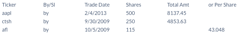
Notice you don’t have to put the per share in if you have the total amt or visa versa.
Copy only the information regarding the trades. Do not copy any headers:
And make sure you have SIX (6) columns even if the Per share is empty.
Copy, paste and hit update.
Here are two articles Chuck wrote that will be helpful:
Which Is the Better Valuation Metric? The P/E Ratio or the PEG Ratio: Part 1
When is the PEG Ratio Superior to the P/E Ratio? Part 2
Here’s what you do: You take the current price of the stock, divide it by the Blended P/E ratio reported on FAST Graphs, and this will tell you the exact earnings number that the Blended P/E ratio is calculated upon. Then look to the bottom of the graph at the last actual earnings of the company, and then look to the next forecast earnings (marked with a capital “E”) and you will note that your earnings calculation is between those two numbers (past versus future). How far it is from the most recent will be determined by how far into the new fiscal year you were in. NOTE: All reported P/E ratios are technically wrong, however, we believe the Blended P/E ratio will be the closest to the current actual earnings power of the company.
Dividend Champions have increased their dividend payout for at least 25 consecutive years.
Dividend Contenders have increased their payouts for 10-24 years.
Dividend Challengers have increased their payouts for 5-9 years.
Total Annual ROR is a calculation based on 12 months. It’s a multiple of the Total ROR stretched out for a year.
For example, if you were examining 1 day and it changed by 1% in a day, then roughly the annualized rate would be 365 X that number – because the 1 day then would be annualized out.
The estimate data presented on the historical FAST Graph is the consensus estimates of analysts provided by FactSet. These are specific consensus earnings estimates for the next couple of years. Sometimes there will be estimates going out further, but there are typically very few analysts offering forecasts beyond 2 years.
TL stand for Trend Line.
There are five sets of calculators, the first two are based on specific consensus analyst estimates 1 to 3 years forward depending on the company and how many analysts are following it. These specific estimates and the number of analysts come directly from S&P Capital IQ.
The third calculator is driven from an additional long-term (3 to 5 year) growth rate estimate. This is actually a different estimate that applies to the longer-term. The F.A.S.T. Graphs™ calculator where these long-term estimates apply is the “LT Growth” calculator. It is solely based on the long-term growth rate and is drawn as a trend line (TL indicates trend line).
With this calculator, the near-term estimates should be ignored and only the last year or two’s numbers should be evaluated. The reason for this is because earnings growth is simply extrapolated out based on the 3 to 5 year growth rate separate estimate described above. The final two calculators are not specifically based on estimates. One of them allows you to input various historical growth rates as a proxy for estimates, and the final calculator is a custom calculator that allows you to put in your own inputs.
Click here to take you to our Documentation Tab of the Website – “Forecasting Calculators”
FAST Graphs™ automatically creates what we call a value corridor. We supply two orange lines above and two orange lines below the consensus estimate line. The subscriber should realize that these numbers represent hopefully rational expectations but they shouldn’t be thought of absolutely precise. Any time the stock price is within these orange corridors it would theoretically be at a reasonable value. Of course, if it’s within the two above you can argue that it’s moderately fully valued to even slightly overvalued, and of course, if you saw the price at these two bottom orange lines, you can argue that the stock was significantly undervalued, all of that of course based on what the consensus estimates for this year, next year, and then the three to five year period following that actually are.
The additional blue lines just provide different PE ratios, and you can look at the scale to the right of the forecasting chart and see what these lines represent.
TL EPS Tot Ann ROR is based on earnings.
TL Tot Ann ROR is based on cash flows, or FFO (Funds from Operations) which is used for valuing REITs and MLPs.
Simply left click your mouse one time on the triangle and the pop-up will go away.